MarksThe wordmark, the monogram and the period, with their rules.
Brand book · v2 · October 2026
Vadavker Brand System
One brand as a system: every value on this page is a token in the brand repository, and every surface follows it.
ColourNine roles, one signal, four themes on file.
Geist
Geist Mono
TypeOne family for reading, one for measuring.
Strategy,motion,and the proof.
MotionEight eases, six durations, five signature moves.
SpaceA 4px base, ten steps, a section rhythm that varies on purpose.
Precisebut not detailed
Quietbut not modest
Confidentbut not selling
Sharpbut not clever
VoiceFixed voice, tone by reader state, three tiers of words.
Quiet chrome, loud craft. The brand surfaces stay calm and monochrome with one signal colour; the work and the motion carry the rest.
01
Marks
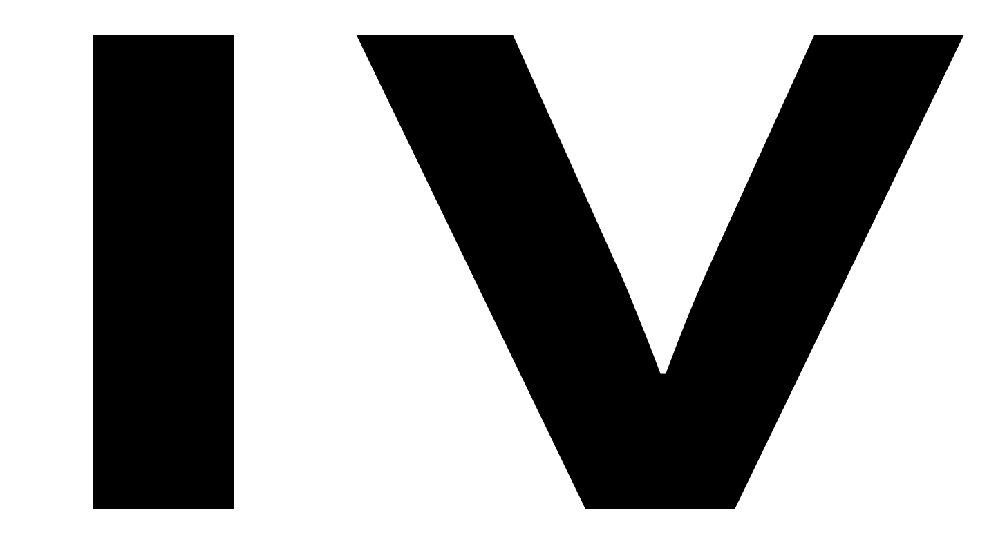
The wordmark is the surname in wide, tracked capitals with a square period in the signal colour. The period is the mark's one gesture: the last word, finished. The monogram IV carries it where the wordmark cannot fit.
Wordmark on ink
On paper · 420 · nav 160 · minimum 96
Monogram · favicon 32 and 16 · avatar
Clear space: one period square on every side, two in print
Minimum size
Wordmark 96px on screen, 24mm in print. Below 96px the monogram takes over. Monogram 16px.
Which version
Paper letters on ink, ink letters on paper. On any background darker than mid grey use the paper version; on photographs, always on a solid plate.
The period
A square the width of the letter stem, on the baseline, in the signal colour of the active theme (the on-paper cut on light surfaces). In one-colour settings it takes the letter colour.
Lockups
The wordmark stands alone. No "Studio", no tagline attached, no partner logos closer than the clear space. Build Better Websites, the publication, is set in the type system, never as a second mark.
Construction
The period square is the unit. Clear space is one unit on every side (two in print), and the grid below is drawn in units from the baseline and the left stem of the V. The wordmark holds its shape down to 96px wide; below that the monogram takes over, down to 16px.
Positive and reversed
Ink letters on the light surfaces, paper letters on the dark ones. The period is the signal on dark plates and its deeper on-paper cut on light ones, so it never fades into the cream; on the signal plate the mark goes one-colour, in ink (apricot is a light colour).
Do not
Assets
The SVG is the source; the PNG pack and the favicon set are built from it. Copy the markup straight from a panel, or download the files.

Downloads work on the hosted book; this preview shows the files only.
02
Colour
Nine roles, one default theme, three alternates kept on file. The code speaks in roles (ink, paper, signal), the theme sets the values, so a change of heart is a one-line switch and never a redesign. Click a swatch to copy its hex.
In use
Your company leveled up.
Your website didn't.
Your website didn't.
One slot openLet's talk
Proposal · KickoffVerrill Cabinetmakers
Strategy, motion-led design and the one number that proves it worked. Two rounds per phase, fourteen days of support. Read the process.
Muted text on paper, 4.6:1
One signal
The signal colour is a fill, a highlight, a period. Never running text on paper (). On ink it is text-safe (). There is no second accent.
Links
On paper, links are ink with an underline. On ink, links are paper with an underline. Colour is not the link cue.
Functional colours
Success, warning and error are tokens with their own contrast checks per theme. They are not brand colours and do not count as an accent.
Contrast
Ink on paper . Muted on ink , muted on paper . Signal text on paper uses the deeper signal-text value, .
Forest at the core
One dark hue carries the brand; the signal is the only other colour that ever speaks. Under the two panels, the tonal scale of that hue from black to white, and the grey scale it sits against. The scale is derived from the token at runtime; only the marked step is a brand value.
The palette
Every family in ten steps, black on the left, white on the right: the ink hue, the signal, then the three functional colours. The steps are derived from each token and exist for charts, states and tints; only the token itself is the brand value.
Specifications
Each family divided into ten swatches from dark to light. The row with the edge mark is the token itself; the rest are derived. Click a row to copy its value.
Contrast
| Pair | Ratio | Use |
|---|
Themes on file
03
Type
Geist for everything that is read, Geist Mono for everything that is measured. One family keeps the chrome quiet. Geist has no optical sizes, so tracking tightens as size grows and sits at zero for reading. Type a line to see it in every role.
Geist
RegularMediumSemiboldBold
ABCDEFGHIJKLMNOPQRSTUVWXYZ abcdefghijklmnopqrstuvwxyz 0123456789 .,;:?!&@()
Geist Mono
RegularMedium
ABCDEFGHIJKLMNOPQRSTUVWXYZ abcdefghijklmnopqrstuvwxyz 0123456789 {}[]<>=/*
display
44 to 76 · lh 1.02 · -0.05em · 600
site hero, proposal cover
44 to 76 · lh 1.02 · -0.05em · 600
site hero, proposal cover
headline
32 to 48 · lh 1.1 · -0.04em · 600
section titles, OG title
32 to 48 · lh 1.1 · -0.04em · 600
section titles, OG title
title
20 to 24 · lh 1.3 · -0.02em · 600
cards, hub page title
20 to 24 · lh 1.3 · -0.02em · 600
cards, hub page title
body-lg
18 · lh 1.6 · 0 · 400 · 65ch
proposals, hub reading, site lede
18 · lh 1.6 · 0 · 400 · 65ch
proposals, hub reading, site lede
body
16 · lh 1.5 · 0 · 400 · 70ch
site paragraphs, hub UI
16 · lh 1.5 · 0 · 400 · 70ch
site paragraphs, hub UI
body-sm
14 · lh 1.45 · 0 · 400
widget copy, captions
14 · lh 1.45 · 0 · 400
widget copy, captions
label
12 · lh 1.33 · +0.08em · 500 · caps
eyebrows, meta, nav
12 · lh 1.33 · +0.08em · 500 · caps
eyebrows, meta, nav
mono
13 · lh 1.54 · 0 · 400 · tabular
numbers, dates, code
13 · lh 1.54 · 0 · 400 · tabular
numbers, dates, code
button
14 · lh 1.43 · 0 · 500
14 · lh 1.43 · 0 · 500
Start a project
hebrew
Heebo · body lh 1.6 · tracking 0
labels: weight, never tracking
Heebo · body lh 1.6 · tracking 0
labels: weight, never tracking
אתרים לחברות שגדלו מהאתר הישן שלהן. אסטרטגיה, עיצוב מונע תנועה, והמספר שמוכיח שזה עבד.
Why Geist
A precise neo-grotesque with a full weight range, open licence, a matching mono, and a cap height that Heebo matches within 0.3% so Hebrew pages keep one rhythm.
Floors
Nothing under 12px, nothing lighter than 500 at 12px, 14px for anything read. No thin weights. No tight leading on three or more lines.
Social and film
On a 1080 canvas: 40px floor, 48 body, 96 and up for headlines, 120 to 160 display. Film covers: three to five words at 140px and up.
Platforms
Substack stays on its system sans preset, the closest it gets to Geist. Email: Geist, Helvetica Neue, Helvetica, Arial, 14px, no tracked caps, the wordmark as an image.
04
Space
A 4px base, ten named steps, and a section rhythm that varies on purpose: the same padding everywhere reads as uncommitted.
Layout
Container 1200px. Section padding 120 / 80 / 64 by weight of the section. Reading measure 65 characters, never full width.
Radius
Controls 999px (pills) or 7px (tiles). Cards 12px. The wordmark's period is never rounded.
Borders
One hairline at 14% of the text colour. No shadows on cards; elevation is a surface step, not a drop shadow.
05
Motion
Motion is the signature. Eight named eases, six durations in two classes, and five signature moves. Everything else on a page is standard and stays quiet: standard moves use tap, touch and leave under 0.6s; signatures alone use land, settle and swap above it. Click an ease to see it run.
Durations and staggers
| Token | Seconds | Class | Use |
|---|---|---|---|
instant | 0.15 | productive | press, focus, colour change |
quick | 0.35 | productive | hover, underline, menu items |
state | 0.6 | transition | accordion, modal, dismiss, curtain cover |
move | 0.8 | expressive | page enter, block reveal |
reveal | 1.0 | expressive | line reveal, counter |
hero | 1.2 | expressive | the one orchestrated moment per page |
stagger | word 0.03 · line 0.06 · card 0.08 · max 0.12 | window cap 0.8s total; importance order, nav last |
Signature moves
Strategy,motion,and the proof.
Mask rise
reveal 1.0 · settle · stagger.line 0.06Label roll
state 0.6 · swap (osmo)hover itMagnet pull
radius 0.7w · pull 0.3 · touch, return on settlemove near itWork
Curtain
cover state 0.6 curtain · beat · enter move 0.8 landOdometer
hero 1.2 · settle, swap on digitsThe law
- Under 150ms for feedback that happens often; 200 to 300 for state; 400 to 600 for reveals; 800 to 1200 for one hero moment.
- Exits are faster than entrances and never take the page-exit duration.
- One focal element at a time. If two things move, one of them is wrong.
- Stagger by budget: cap the whole cascade at 0.8s, importance order, navigation last.
- Never block input. Nothing waits for an animation to finish.
- Reveals start from a visible resting state; nothing is hidden waiting for an observer.
- Reduced motion means instant, or opacity only. The same for a
?skipanimswitch. - No bounce, no elastic, no back eases, no spring with bounce. Returns land on settle.
- The native pointer stays. A contextual label on media is the only cursor change.
- No card lift. Elevation is a surface step, not a hover shadow.
06
Voice
The voice is fixed; the tone follows the reader's state. A founder reading a proposal gets the same person as a stranger reading a post, calmer or warmer by what they need.
Precisebut not detailed. One number, not a dashboard.
Quietbut not modest. Say the thing, then stop.
Confidentbut not selling. Prescribe, never pitch.
Sharpbut not clever. Plain words, short sentences.
Words
Always
strategymotionproofone numberbuild slottreatmentround
Sometimes
premiumsystemcraftpartner
Never
noisecontent creatorfreelanceStudioteardownprice cardtool badgesstockhustle
Writing the name
Ido Vadavker, two words, never Studio. The wordmark is an image, not typed caps. Build Better Websites is the publication, written in full.
Numbers
Real ones, with their denominator. Never a floating price. Never likes.
Where the rules live
Voice by platform and the eight markers of Ido's Hebrew live in content-os; the newsletter skill holds the long form.
07
Imagery
Proof first
A still or a film from a real build or a Hero Treatment beats any illustration. Concepts are labelled concepts.
Ink for writing
Essays and opinion pieces get a brush-ink drawing of one everyday object, the point of the piece in the signal colour. Gold on cream for Substack and the site, paper on ink for LinkedIn and X.
Never
Stock photography, generic AI renders, device mockups with no real screen, emoji as decoration, screenshots with the native browser chrome.
Frames
Film 16:9 and 9:16 with the wordmark in a corner at 160px; before and after 1:1; style board 4:5.
08
Templates
Every recurring surface has one template that consumes the tokens. Shown here at reduced size.
Email signature
Ido Vadavker
Premium websites, from strategy to launch
+972 52 704 6674 · idovadavker.com
Premium websites, from strategy to launch
+972 52 704 6674 · idovadavker.com
OG image 1200 × 630
How allO got 181% more visitors with a redesign
Social trio and film cover
Proposal and hub
Paper surfaces, body-lg at 65 characters, titles in 600, the signal only as a tag fill and a highlight. The client's name is the biggest thing on the page, not ours.
Films
Wordmark bottom-left at 160px over a solid plate; endcard on ink with the wordmark centred and the period landing last.
Feedback widget and tools
Ink chrome, paper panels, 14px minimum, functional colours for status only.
09
Governance
version 1.0.0
The source of truth is the brand repository: tokens in the open design-tokens format, the marks as SVG built from a script, the fonts, a registry of every touchpoint, and the propagate script that pushes a change to all of them and prints the manual checklist for the rest.
To change anything: edit the token (or flip the theme or marks switch), build, propagate, walk the printed checklist, record the verification date in the registry, bump the version here.
What this book deliberately leaves out: sub-brands, a legal layer for strangers, and documentation of every surface. One person, one brand, one procedure.
Changelog
- 1.0.0 · 2026-10 First system: wordmark and monogram, forest theme with three alternates, Geist type roles, 4px space scale, eight eases and five signature moves, voice pairs, templates.
- Before 1.0: Cabinet Grotesk and Satoshi, gold accent on warm black, a text logo and a Georgia favicon, values copied by hand into eight repositories.